7 simple tricks to level up your UI design

Harry Dry
Apr 2, 2019
Over the last three years at Crowdform we’ve designed countless digital products. Along the way we’ve picked up a few subtle and unexpected tricks which can really level up a product design. So we thought: why not collate these tips into a series of articles to help the other UI designers out there?
1) Overlay shapes across sections to add more depth
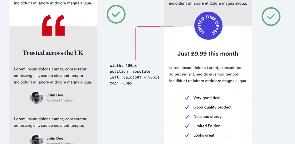
Sometimes a straight transition from one section to another looks, well...boring.
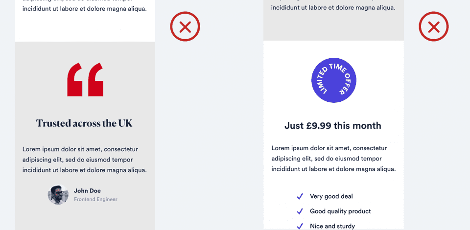
If you have a graphic element on your page, it’s worth experimenting by overlaying it across two sections. Your design should look more fluid and less compartmentalised.
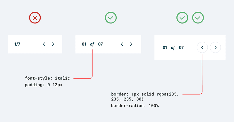
2) Don’t use italics...until the right moment
Italics are dangerous generally speaking. They’re often a honeytrap for amateur designers, who are trying too hard to make something stand out. But used sparingly and with the right font they can be very effective.

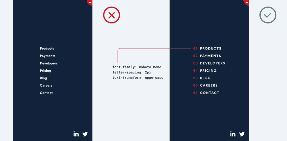
3) When numbering 01, 02, 03 always looks nicer than 1,2,3.
A solitary number can appear “floaty” and result in the design looking bare and disjointed. Adding an additional “0” helps turn the number into more of a shape. Your eye subconsciously draws a square around it, making it feel stronger and linking it with the other elements on the page. The design should now feel as solid as a rock.
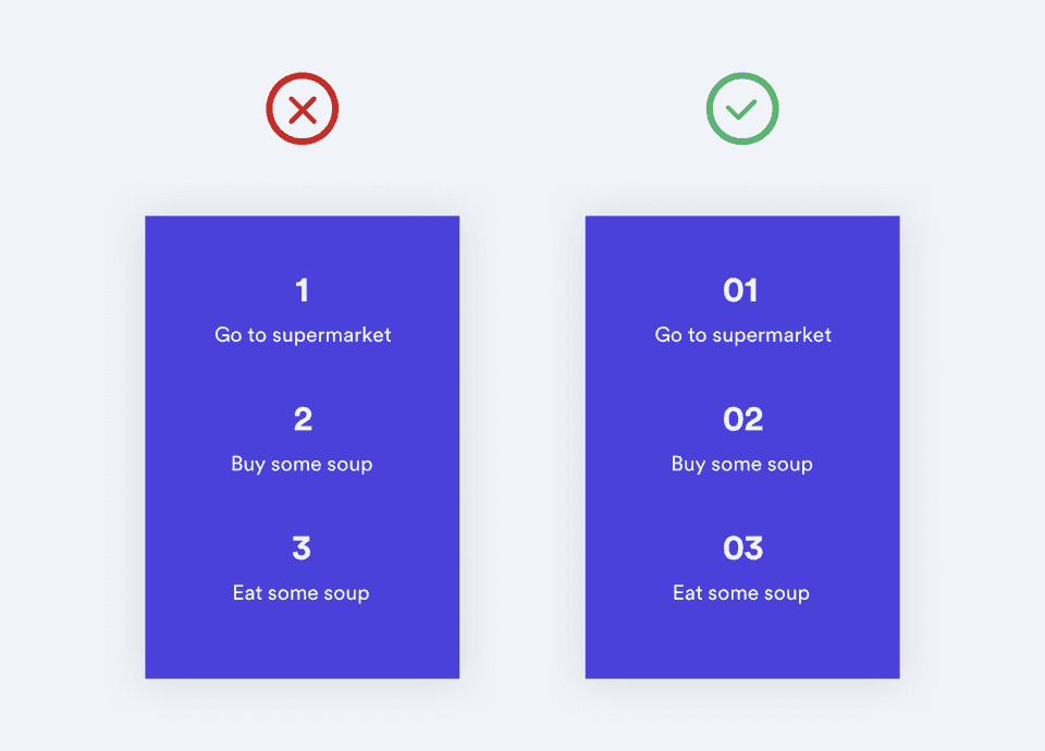
This technique can also be very effective when enhancing a menu or a list. In this case it’s also worth experimenting with all caps and bumping up the letter spacing as well
**4) Nice icons can make all the difference**
The benefit of icons is that they allow content to be summarised succinctly, whilst also looking great visually.
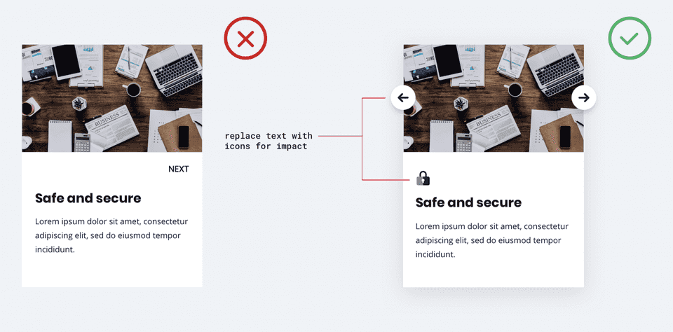
The first rule is consistency. As tempting as searching on websites like the noun project are, if you’re not careful you’ll end up with a bunch of icons that look like odd pairs of socks. It’s worth doing some research and finding an icon pack which matches the feel of your site. A current favourite at the moment with the Crowdform designers is Essential Icons by Eleken.
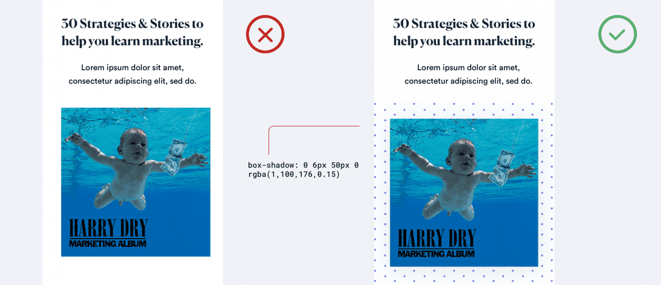
5) Background patterns add depth to stand alone images
Static background images, particularly on mobile design, can appear detached. Underlaying subtle background patterns beneath hero images can be an easily implemented technique to add depth to a design.
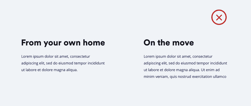
6) Use illustrations to break up lots of body text.
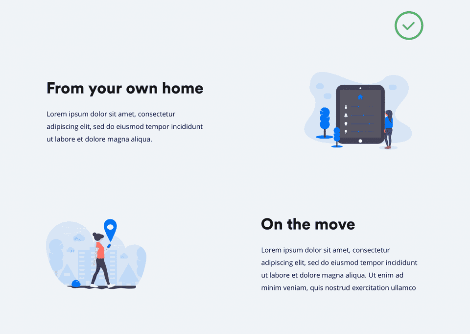
It’s no secret that a lot of body text can look daunting and unappetising. Adding quality illustrations is a great way to bring text to life and make it more readable. Plus the recent trend for abstract, “anti-digital” illustration means they often don’t have to be directly relevant to the text – just set the right tone.
“But I’m a designer not an illustrator” I hear you cry. Well, over the past year some superb open source illustrations packs have sprouted online. My personal favourite being unDraw.co by the very talented Katerina Limpitsouni or if your feeling slightly riskier absurd.design is also a great choice.
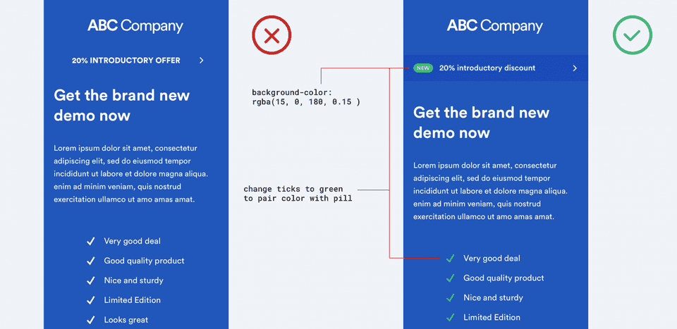
7) Use subtle visual cues to draw attention to an element.
When it comes to emphasising a particular element a lot of designers resort to capitalised text and bolder font-weight. Instead maintain a regular font-weight, and introduce subtle touches, such as coloured pills or light background overlays.
To conclude
Thanks for reading! I hope you enjoyed the article and learnt a few practical things. If you're interested in having the CF team take a look at your company, we're currently offering a free design review. So please get in contact with us and we can arrange a time for a call! For more tips and tricks about building startups follow @crowdformstudio on twitter or join the email newsletter below.

Harry Dry
Harry is a product manager at Crowdform and likes to write stories about startups & marketing in his spare time. You can find him at @harrydry on twitter or mailto:harry@crowdform.studio.